Interactive figures are used to let users customize the viewing experience and reveal additional information. By making complex figures interactive, it enhances the learning experience as well as engages the learner.
Interactive figures need to be implemented with accessibility in mind by adding descriptions, checking for sufficient color contrast, ensuring the experience is operable with a keyboard as well as a mouse, and announcing the dynamic updates programmatically to ensure an inclusive experience.
How to Implement
This section lists the techniques that need to be implemented to make interactive figures accessible.
Designers Need to…
Specify short textual descriptions for images
Provide instructions on how to operate the interactive widget using a keyboard only, a keyboard with a screen reader, and a mouse
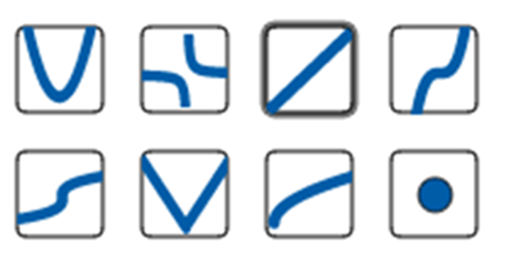
Do not rely only on visual attributes such as color, size, or shape to label elements. Use discoverable properties such as text labels instead. For example, don’t instruct students to find the intersection point between the red and green curve. Instead, you should label each curve with a letter and ask the student to find the intersection point between curve A and B.
When using an image as the only form of visual and/or semantic identification for an interactive element such as a button or link, the image alt text should describe the purpose of the element rather than the image it contains. For example, a back to previous page link containing an image of a left pointing arrow should have an alt text of “back to previous page” rather than “left pointing arrow.”
Content Writers Need To…
Provide clear instructions on how to use the interactive figure using both a keyboard and a mouse. This can include information on how to navigate the figure and how to interact with the various elements.
When creating a textual description for an interactive figure, it’s important to consider the starting position of the user and provide a comprehensive overview of the figure’s elements. This can include information such as the type of figure, its size and shape, the colors used, and any important details or features.
Another approach is to consider the “outside-in” method when describing an interactive figure. Start by describing the overall appearance of the figure, then focus on key details. For example, “This is a 2-dimensional graph with 3 curves. The x-axis is labeled speed and the y-axis is labeled force. The first curve originates at the origin, and it is labeled…”
Do not describe elements using only visual attributes such as color, size, or shape to label elements. Use discoverable properties such as text labels instead. For example, don’t instruct students to find the intersection point between the red and green curve. Instead, you should label each curve with a letter and ask the student to find the intersection point between curve A and B.
As the user interacts with the figure, the description should reflect any changes or updates. However, it’s important to avoid repeating information that has already been stated, as this can be confusing and redundant. Instead, focus on highlighting the most important and relevant changes, and providing context and meaning for those changes.
Practices to Apply
Header text
Ensure that all interactive elements can be accessed and operated using a keyboard, without requiring a mouse or other pointing device. Provide clear and intuitive keyboard shortcuts for complex interactions.
Use high-contrast colors to ensure that the interactive figure is easily readable and understandable by learners with visual impairments. Avoid using colors that are similar in hue or brightness, as they may be difficult to distinguish.
Text = minimum 4.5:1 ratio User interface components and graphical objects = minimum 3:1 against adjacent colors
Provide alternative text for all non-decorative images and programmatically announce dynamic updates. For example: (1) The first time the interactive graphic is described, make sure the user has a complete description of the information needed to understand the graph. (2) As the user moves through the interactive, describe new movement and focus on what the user needs to know to be successful. Avoid repeating details that were already described. (3) Once alt text is written, test the quality within the interactive to ensure proper useability, capturing all key details.
Place instructions above the interactive so screen readers hear them first before moving into the figure.
Provide unique labels on all interactive elements.For example: ”‘Button select basic function number 3 of 8. The basic function is a straight line…”