When using color, there are 3 things to keep in mind:
- Do not use color alone to convey information
- Ensure text and images of text have a contrast ratio of at least 4.5:1
- Meaningful non-text content has a contrast ratio of at least 3:1 against adjacent colors.
Do Not Use Color Alone to Convey Information
Requirements
Provide additional identification that does not rely solely on color perception. The key is that there is a textual means of drawing a user’s attention to the text that also uses color for that purpose.
Important Info
Avoid using black text on red background or red text on green background color combinations. Some color blind students will only see browns or greys and will not be able to read the text.
Tips
Check for color issues by enabling Greyscale Mode. Ask yourself, “are there any slides that have information you can’t understand?”
Color Contrast
Requirements
The relationship between the foreground color and background color of text (and images of text) is called contrast ratio. The required contrast ratio for text less than 18 point and 14 point bolded text is 4.5:1. For text greater than 18 point, the required contrast ratio is 3:1.
See Font Type and Size, for specific PPT content font size requirements.
Important Info
Use a color contrast analyzer to check contrast ratios. Here are two free tools:
Do not use “hidden” text (i.e. white font against a white background) to convey information to screen reader users. This will result in a color contrast error in some accessibility checkers.
Meaningful Non-text Content
Requirements
Meaningful non-text content in graphical objects such as charts and graphs must have a contrast ratio of at least 3:1 against adjacent colors.
Exceptions – when a particular presentation of graphics is essential to the information being conveyed. Examples include:
- Logotypes and flags
- Real life scenes such as photos of people or scenery
- Anatomy and other educational images that need to provide accurate color details
- Heatmaps
Tips
Meets the standard

Image credit: W3C.org
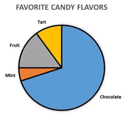
By simply outlining the pie slices in black, achieves the requirement.
