Requirements
- Use PPT’s Table features to create tables. Avoid using images of tables.
- Tables should be a simple grid with predictable rows and columns.
- Ensure a Header Row or Header Column has been defined in the Table Style Options.
- Do not merge or split cells.
- Do not leave table cells blank. Instead, place the word “blank” in the cell and style using Arial black, 1 point font.
- PPT created tables do not require alt text per Pearson guidelines.
- Images of complex tables may be used; short and long alt text are required. See Alternative Text /Long Descriptions for more information.
- In rare cases, layout tables may be used to display information. Layout tables should not be used for design purposes.
Important Info
Tables with images or MathType objects placed within cells
Use the following workarounds to ensure accessibility.
- Place alt text within the appropriate table cell. Alt text may be written in small font size to fit in the table cell.
- Alt text should be styled with black font. (Using black font on a white background will not trigger color contrast errors in LMS accessibility checkers like in Blackboard.)
Design Technique
You may need to adjust the cell margins so text fits behind the equation. Do this by clicking in the cell and using the tab stops in the ruler.

- Place the object (STEM equations must be created in MathType) over the alt text within the cell.
- By default, objects have a “no fill” background so change to a “solid fill, white” background. Do this by right-clicking on the equation to open the menu box. Go to Format Object > Solid fill > Color > White.

- Mark the object as decorative by checking the “Mark as decorative” in the alt text description box. This object is considered decorative because the alt text is visually hidden in the table cell.
- Make sure an accessibility workaround note is placed in the Properties box (File > Info > Properties > Advanced Properties > Summary > Comments)
Workaround Comment Example:
Alt text for images/equations within table cells has been placed behind the object intentionally to provide a better screen reader user experience.
Two Types of Tables
Data Tables – a data table is a table when row headers, column headers, or both are present. Data tables should be created as a simple grid using Microsoft PPT table design feature. Make sure to define headers in the Table Style Options.
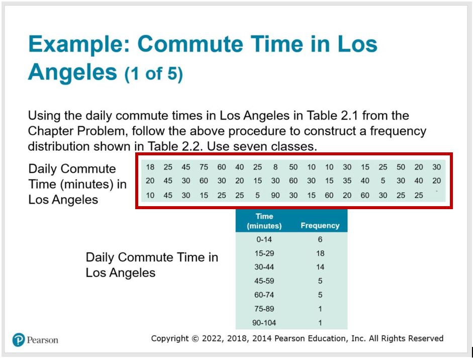
Layout Tables – a layout table does not have row headers or column headers due to the nature of content in the table. Layout tables present accessibility barriers to screen reader users. However, in rare cases, layout tables may be used to display an array of numbers. Here is a good example of an acceptable time when a layout table may be used.

In this example, a list of daily commute times is displayed in a layout table. The commute times are not in any order, just a series of data points. The student uses this information to create a data table with a defined header row (column 1: Time (minutes), column 2: Frequency). Having the raw data in a layout table allows the user to tab through and consume the random numbers more efficiently than if it was an image with alt text.
When using layout tables, mark the top row the header row in the Design Style Options. This will ensure the table is not flagged as an Error in the accessibility checker.
Do not use layout tables for design purposes.
Tips
- Insert a table using the ribbon: Insert > Tables. This will ensure screen readers announce the table as a table.
- If there is information that doesn’t easily fit into a non-merged cell, try using the Title and Two Column slide layout. This might give you the flexibility to add this information in the second placeholder box.
