Always refer to the main Pearson general guidelines when writing alternative text for images.
When describing complex images such as charts, graphs, and diagrams, keep in mind the following key aspects and examples. Not all guidance will apply to all images.
- Begin with a clear and concise summary: Start your description with a summary of the chart/graph/diagram’s purpose and main features. Avoid alt text that only states, “A chart”, “A graph” or “A diagram”.
- Describe the chart/graph/diagram accurately: Make sure the alt text accurately describes the image and its purpose. Include relevant data points, labels, and any trends or patterns that are visible.
- Include the chart/graph/diagram type: Mention the type of chart/graph you are describing, such as a bar chart, pie chart, or line graph. This helps users understand the structure and layout.
- Use clear and descriptive language: Use clear and descriptive language to describe the chart/graph/diagram’s features. Avoid using technical jargon or complex vocabulary that may be difficult for users to understand.
- Consider the context: Think about the context in which the chart/graph/diagram is being used and the purpose it serves. Alt text for a chart in science may be different from alt text for a chart in a TED eTextbook.
Examples
Reminder: The Mastering authoring platform has a title field and alt text field but does not have the functionality for a long description. Alternative text descriptions in Mastering may have more than 255 characters. The eText 2 authoring platform has the functionality for alt text and a long description. For more information about the different authoring systems, see Platform Authoring Information.
Example 1
Alt Text
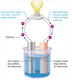
A wire flows from a zinc metal to a copper metal, through a light bulb, which is illuminated.
Long Description
(Must be marked up in HTML)
In the diagram, two metal bars, one zinc and one copper, are immersed in a bucket of water. Zinc metal has a low affinity for electrons, while copper metal has a high affinity for electrons. A wire runs from each bar to a light socket that holds a bulb, and two electrons occur at each wire, while arrows show the direction of electron flow. Electrons flow away from zinc, which is being oxidized, while electrons flow toward copper, which is beign reduced. The flow of electrons illuminates the light bulb.
Example 2
Alt Text
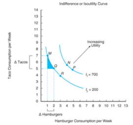
A line graph illustrating an indifference or utility curve.
Note: Surrounding text provided graph detail. In this situation, a long description is not needed.
Example 3
Alt Text
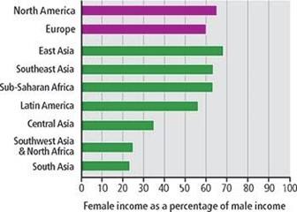
A horizontal bar graph illustrates the female income as a percentage of male income.
Long Description
(Must be marked up in HTML)
The horizontal axis is labeled female income as a percentage of male income and ranges from 0 to 100 in increments of 10 units. The vertical axis has the following markings from top to bottom: North America, Europe, East Asia, Southeast Asia, Sub-Saharan Africa, Latin Africa, Central Asia, Southwest Asia and North Africa, and South Asia. The percentage of female income by region is as follows:
North America (developed): 65 percent.
Europe (developed): 60 percent.
East Asia (developing): 69 percent.
Southeast Asia (developing): 64 percent.
Sub-Saharan Africa (developing): 64 percent.
Latin America (developing): 56 percent.
Central Asia: 35 percent.
Southeast Asia and North Africa: 25 percent.
South Asia: 23 percent.
Example 4
Alt Text
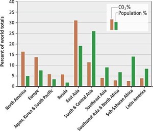
A double bar graph shows the percentage of world totals based on the share of carbon dioxide emissions and population.
Long Description
(Must be marked up in HTML)
The horizontal axis has the following ten markings from left to right: North America; Europe; Japan, Korea, and South Pacific; Russia; East Asia; South and Central Asia; Southeast Asia; Southwest Asia and North Africa; Sub-Saharan Africa; and Latin America. The vertical axis is labeled percent of world totals and ranges from 0 to 40 in increments of 5 units.
The distribution is as follows:
North America: The C O 2 emission is 17 percent, and the population is 5 percent.
Europe: The C O 2 emission is 14 percent, and the population is 7.5 percent.
Japan, Korea, and South Pacific: The C O 2 emission is 6 percent, and the population is 3.5 percent.
Russia: The C O 2 emission is 6 percent, and the population is 2 percent.
East Asia: The C O 2 emission is 31 percent, and the population is 19 percent.
South and Central Asia: The C O 2 emission is 12 percent, and the population is 26 percent.
Southeast Asia: The C O 2 emission is 4 percent, and the population is 9 percent.
Southwest Asia and North Africa: The C O 2 emission is 3 percent, and the population is 7 percent.
Sub-Saharan Africa: The C O 2 emission is 2.5 percent, and the population is 14 percent.
Latin America: The C O 2 emission is 4 percent, and the population is 8.5 percent.
Example 5
Alt Text
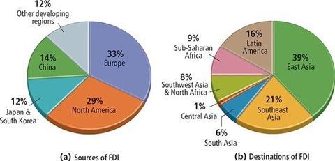
The figure consists of two pie charts labeled a and b, illustrating the sources and destinations of F D I.
Long Description
(Must be marked up in HTML)
Pie a: The sources of F D I are as follows:
Europe: 33 percent.
North America: 29 percent.
Japan and South Korea: 12 percent.
China: 14 percent.
Other developing countries: 12 percent
Pie b: The destinations of F D I are as follows:
East Asia: 39 percent.
Southeast Asia: 21 percent.
South Asia: 6 percent.
Central Asia: 1 percent.
Southwest Asia and North Africa: 8 percent.
Sub-Saharan Africa: 9 percent.
Latin America: 16 percent.
Example 6
Alt Text
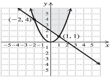
A line intersecting a parabola is graphed on a coordinate plane.
Long Description
(Must be marked up in HTML)
The horizontal axis is labeled x and ranges from negative 5 to 5 in increments of 1 unit. The vertical axis is labeled y and ranges from negative 5 to 5 in increments of 1 unit. The line enters the viewing window in the second quadrant, goes down to the right, and exits the viewing window in the fourth quadrant. The x intercept of the line is (2, 0), and the y intercept is (0, 2). The parabola opens upward and has its vertex at (0, 0). The parabola enters the viewing window at approximately (negative 2.5, 6) and exits the viewing window at approximately (2.5, 6). The line intersects the parabola at (negative 2, 4) and (1, 1). The area inside the parabola and above the line is shaded.
Example 7
Alt Text
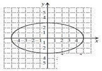
An ellipse is graphed on a coordinate plane.
Long Description
(Must be marked up in HTML)
The horizontal axis is labeled x and ranges from negative 5 to 5 in increments of 1 unit. The vertical axis is labeled y and ranges from negative 5 to 5 in increments of 1 unit. The ellipse passes through (5, 0), (0, negative 3), (negative 5, 0), and (0, 3).
Example 8
Alt Text
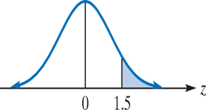
A bell curve drawn on a horizontal axis.
Long Description
(Must be marked up in HTML)
The horizontal axis is labeled z and shows the markings 0 and 1.5. The curve starts from a point on the left of 0 on the horizontal axis, it rises to the right, concave up and then concave down to attain a peak. The curve then falls to the right, concave down, and then concave up, and finally terminates on the horizontal axis to the right of 1.5. A vertical line is drawn from the peak of the curve to the marking 0 on the horizontal axis. A second vertical line is drawn from marking 1.5 on the horizontal axis to meet the curve. The area under the curve and right of the vertical line arising from 1.5 is shaded.
Example 9
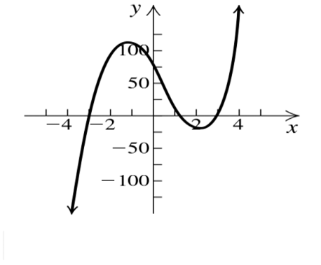
Alt Text
A graph of a curve on a coordinate plane.
Long Description
(Must be marked up in HTML)
The horizontal axis is labeled x and ranges from negative 5 to 5 in increments of 1 unit. The vertical axis is labeled y and ranges from negative 125 to 125 in increments of 25 units. The curve enters the viewing window in the third quadrant, goes up to the second quadrant through (negative 3.95, negative 142.86), (negative 3, 0) to reach its maximum at (negative 1.2, 115.4), then goes down to the fourth quadrant through (0, 75), (1.25, 0) to reach its minimum at (2.25, negative 26.3). Finally, the curve again goes up through (3, 0), (4.2, 164.3), and exits the viewing window in the first quadrant. All numerical values are approximated.
Dated: 2023-12-01